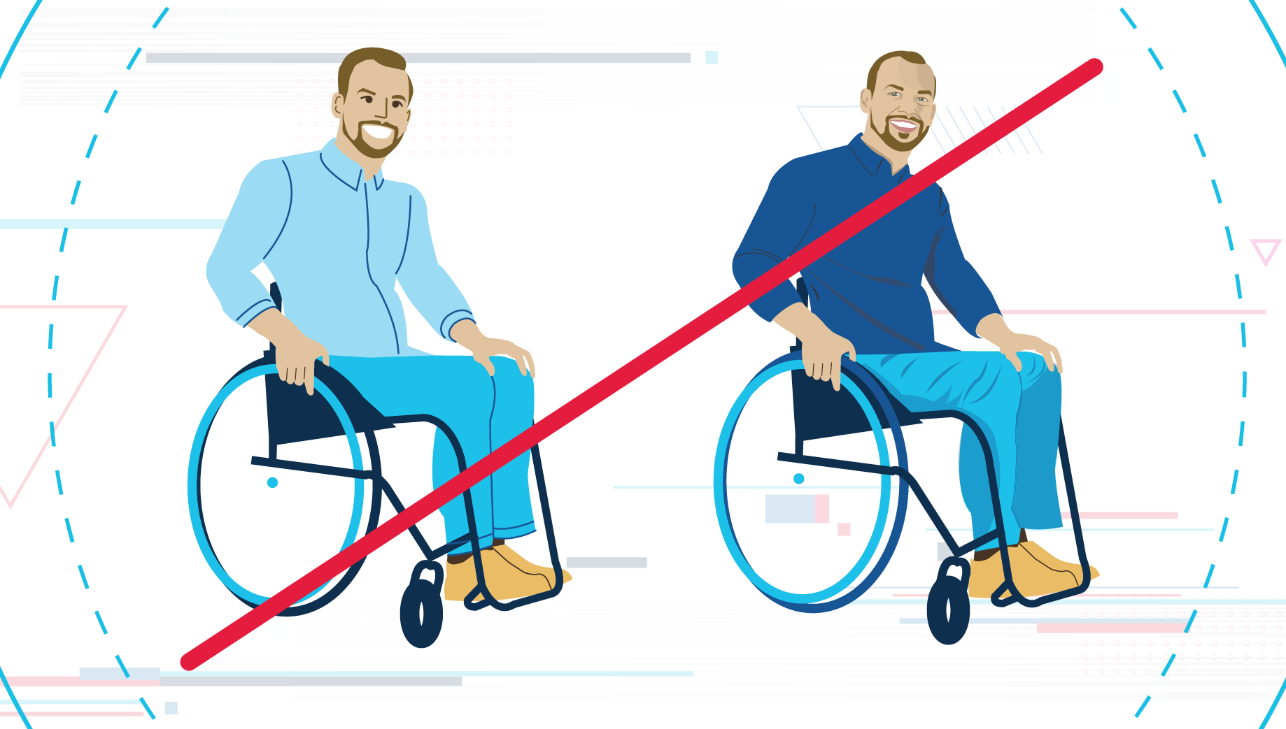
The Department of Veteran’s Affairs (VA), Office of Information and Technology’s (OIT) Illustration Style is a collection of visual and thematic benchmarks designed to reflect our staff, Veterans, and a wide spectrum of diversity central to our organization and those that it serves.
OIT’s illustration style is specifically crafted to visualize and link the content we communicate to people in a wide variety of environments, allowing flexibility and variance in look while still maintaining a consistent visual tone. The design language is streamlined and modern and represents the people of VA OIT’s digital transformation and aim to be a world-class IT organization.
The visual style encourages expressive representation of creative ideas while offering lifelike depictions for more concrete information. It is designed to provide options that will be appropriate for the content it is paired with while moving away from a less cohesive collection of assets created or collected for individual messages. It is specifically designed to allow for maximum creativity from its users while maintaining branding consistency and discouraging brand chaos.
Creating illustration assets will be performed through collaboration with IT Strategic Communications (ITSC), as well as individual illustration assets being available upon request.

The Style Benchmarks
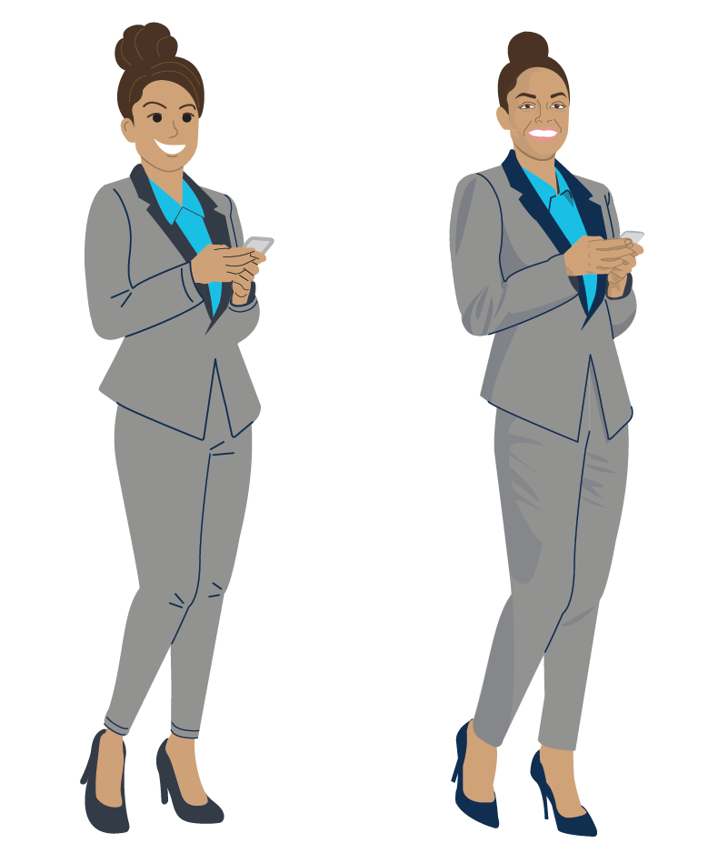
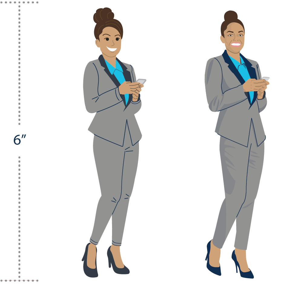
While the OIT Illustration Style is a spectrum, two core styles represent the ends of said spectrum. On one side is the “Expressive” style, and on the other is the more “Lifelike” style. Here are two examples of the same composition in both versions.

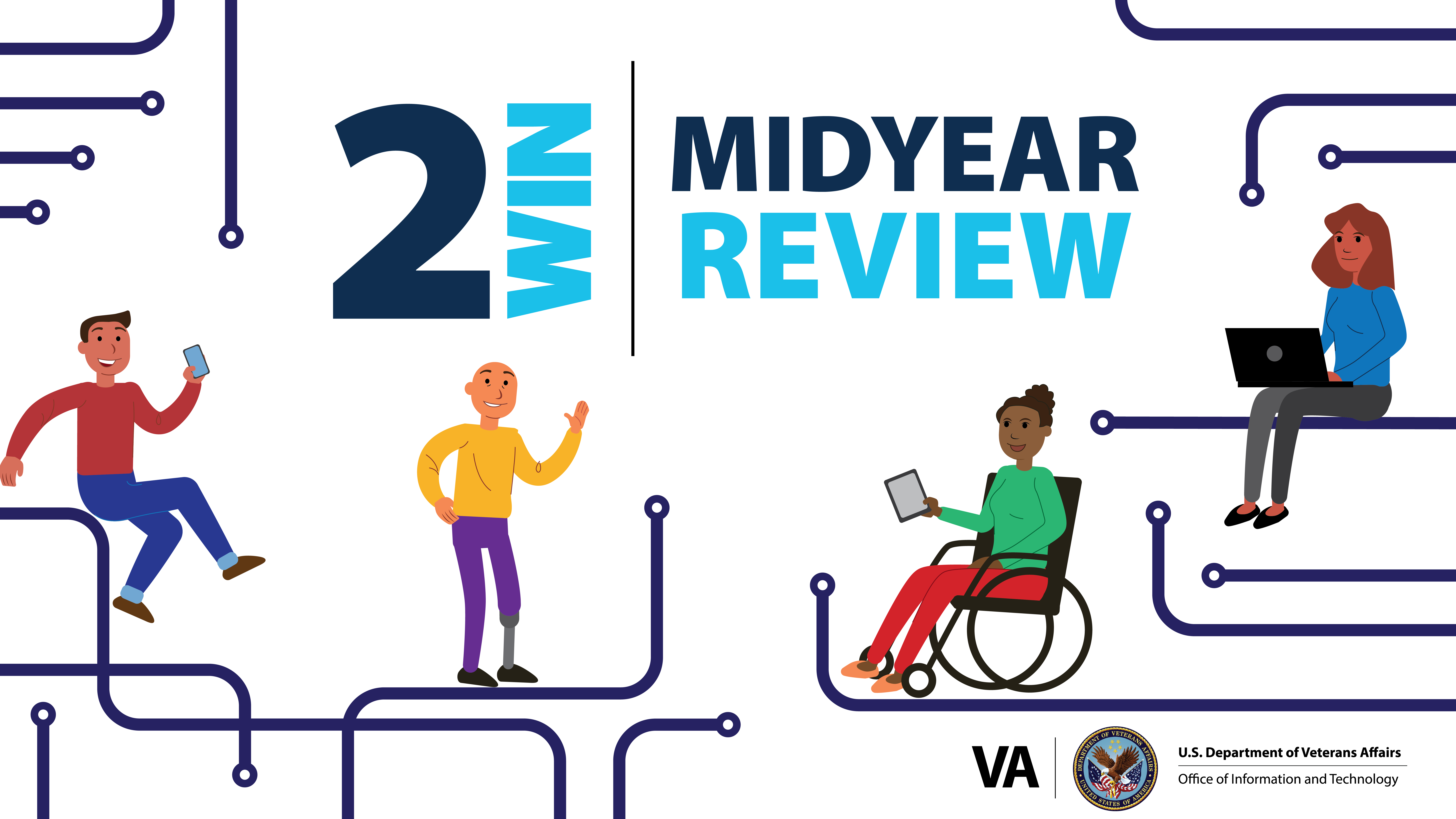
The “Expressive” Style was created to provide a whimsical and engaging visual look that can accurately reflect the agility and flexibility that OIT demonstrates and excels at every day. It is appropriately used when trying to convey a fun, flexible feeling and is not true to life. It can be described as:
- Energetic
- Fantastical
- Elastic

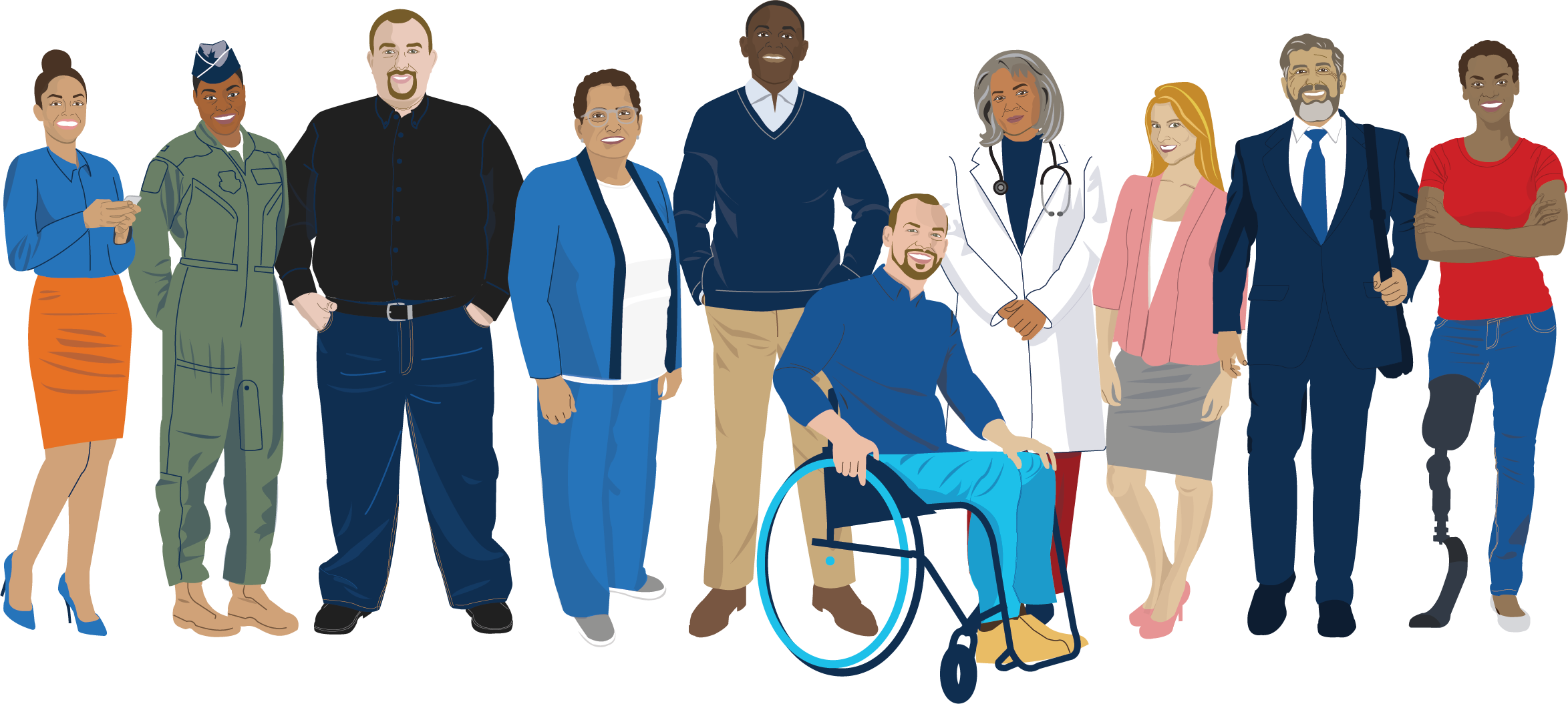
The “Lifelike” Style is streamlined, clean, and engaging, intentionally designed to look both unique and contemporary. Its goal is to create a fresh and accurate depiction of the people of OIT and those it serves. It can be described as:
- Realistic
- Proportional
- Authentic
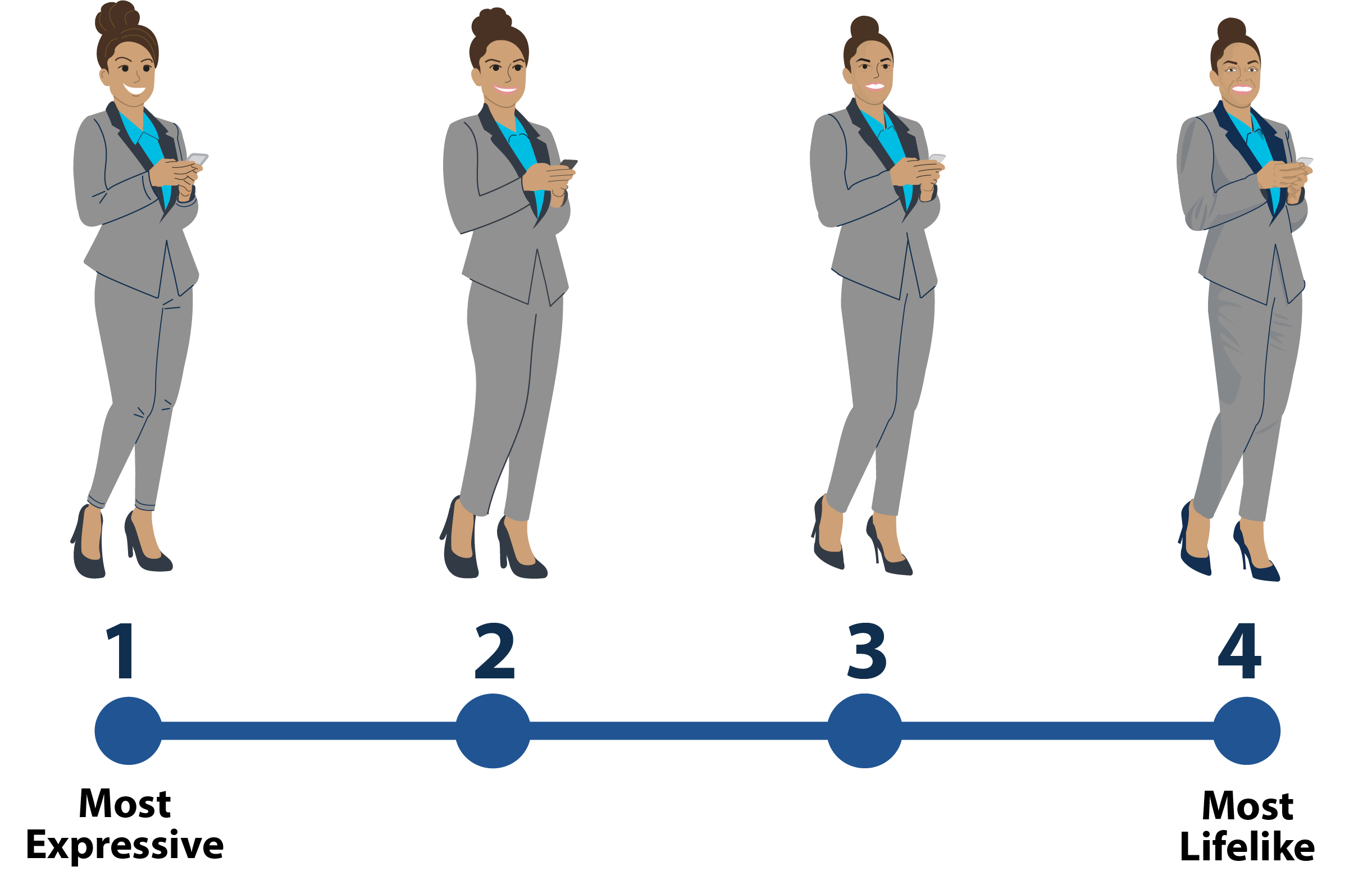
The Style Gradient
These styles offer multiple options that may exist between the two ends of the spectrum depending upon the message’s needs.
Use Case Scenarios
Each style has specific instances in which it is most appropriate. Some requests will necessitate a realistic and accurate illustration, while others will be better suited to a more whimsical presentation.
Expressive style
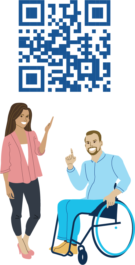
Here is the Expressive style being used in what would be considered an unrealistic scenario. The request was to draw attention to a QR code, and get users interested and excited about its content. Here are two variations of our colorful characters directly interacting with a QR code, something that in this use case can be fun and interesting, but might be stiff and unapproachable if done in a more realistic style.
Lifelike style
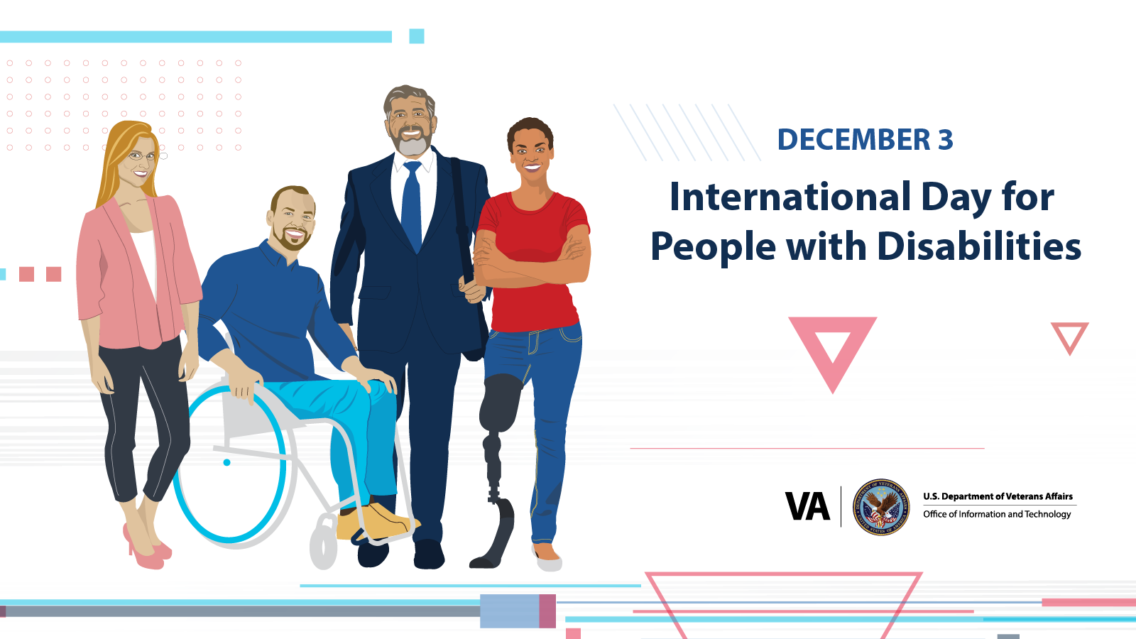
In this example, the Lifelike style is the appropriate choice because the request was to create a series of graphics that included accurate representations of real VA employees. The Lifelike style is able to accurately represent real-world subjects, and give the attractive illustration style touch to them to make them more engaging, while still being appropriate and respectful to their real appearance.
The Expressive Style
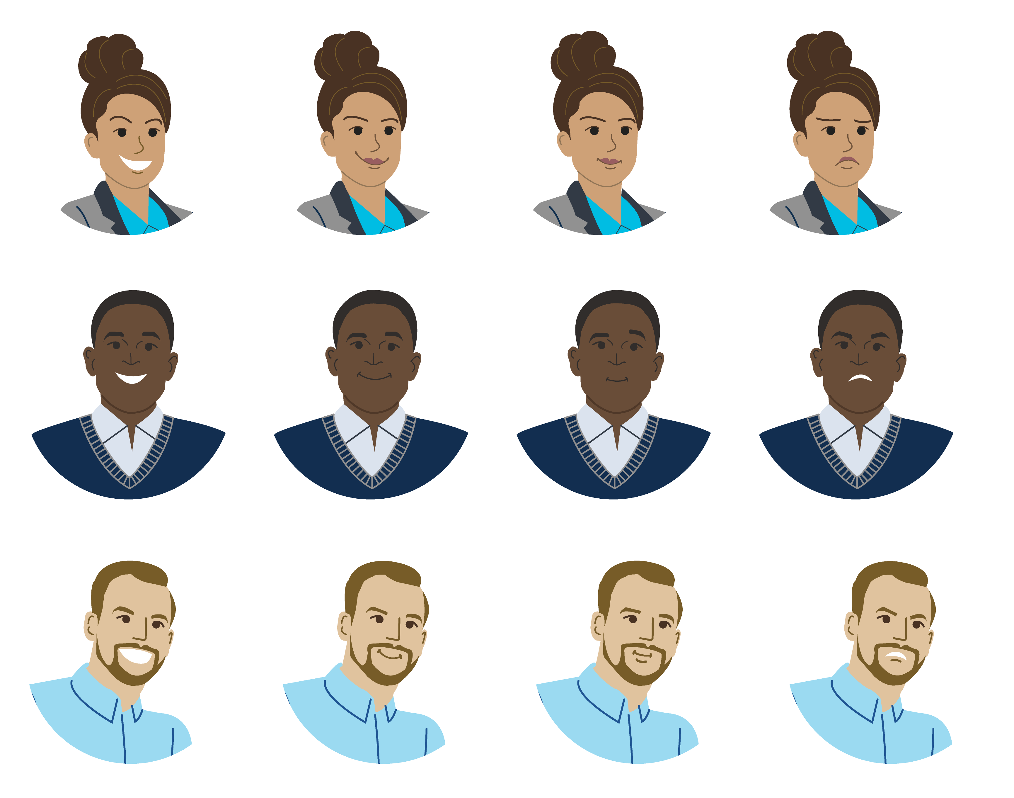
The Expressive style is modular, created by choosing and assembling images and characters from a library of set expressions, faces, simplified body elements, and colors. It is designed to be flexible and to give ample and easy options to create diverse characters.
The “Expressive” style is best used when presenting a message that does not have a direct visual analogue. It excels in optimistic and creative messaging.

What The “Expressive” Style is and isn’t
The “Expressive” style is:
- Energetic
- Fantastical
- Elastic
The “Expressive” style is not:
- Accurate to real life
- Solemn
- Overly detailed
The Lifelike Style
The Lifelike illustrations start with a high resolution photograph as a base, and then build up into the visual look and feel on display here. This allows us to keep proportions, detail, face expression, body language, and represent race, age, and body types accurately. This style can be used to depict Veterans and VA employees with authenticity to create assets when applicable.
The environment and objects are created with simplified shapes and lines, using lighter colors, and white space to direct the attention to the representations of people and creating a sense of depth.
The “Lifelike” style is best used when trying to evoke familiarity with the subject. It is the appropriate choice if an object, place, person, or interface is meant to be depicted with accuracy.
What the Lifelike Style Is and Isn’t
The “Lifelike” style is:
- Realistic
- Authentic
- Proportional
The “Lifelike” style is not:
- Playful
- Cartoon like
- Fictional
Visual Benchmarks (Technical Structure)
What elements unify the two styles?
- Both styles are energetic and exciting, creating a lively tone in images.
- They are simple in concept, but still allow for complex compositions and messaging whenever appropriate.
- Colors are used in an exciting and eye-catching way, while still attached to the OIT color palette.
- Characters are inclusive and diverse, reflecting the broad diversity of our partners and those we serve.
- The overall focus of images is to highlight the characters more than their setting
Technical Structure
What elements unify the two formats?
Format height is 6 inches
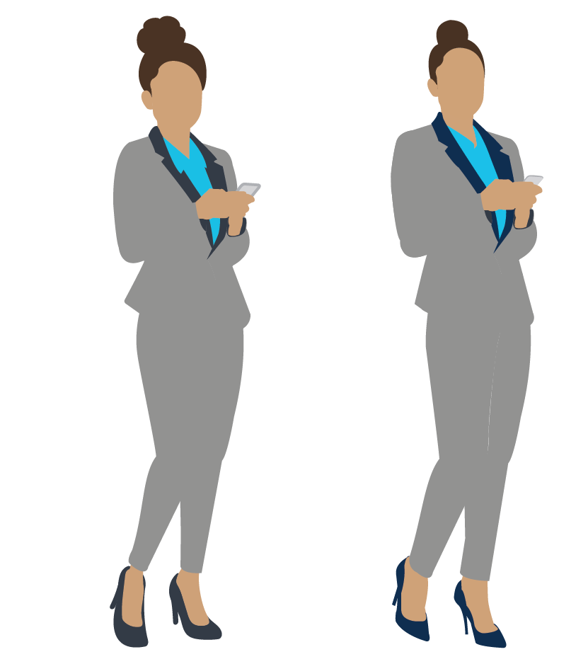
Shapes are solid colors with enough contrast with other elements and background. The outer edges of all characters and figures have no solid outline but stand out from color contrast.
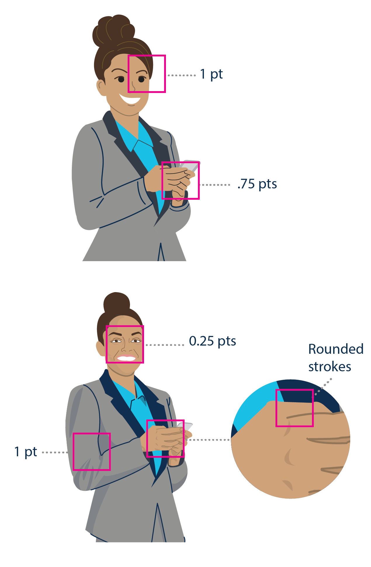
Details are outlined in appropriate tones, and the lines are 0.25 to 2 points thick as appropriate. Lines are used to create movement and shape but not necessarily to define shapes. Strokes are rounded.
Color Palette
The illustration palette includes the core OIT palette, used mostly on clothing and objects. We also created a palette for skin tones, hair, eyes and lip colors. Colors map to the U.S. Web Design System.
Exceptions may be substituted as needed. Illustrations should aim to use this color palette as much as possible.
CORE BRAND COLORS
FFFFFF
#0E1D33
#112F4E
#0076D6
#1abfe5
ACCENT and secondary colors
#E41D3D
#919191
#FACE00
#E66F0E
#7FB135
skin tones
#6B5947
#8E704F
#A86437
#AD8B65
#F09860
#C7A97B
#ECC0A7
#FCE2C5
Hair
#322D26
#422D19
#8E704F
#76766A
#A9AEB1
#C2850C
#E6C74C
Eyes and lips
#005EA2
#5A5F38
#D27A56
#E09AA6
Acceptable Uses
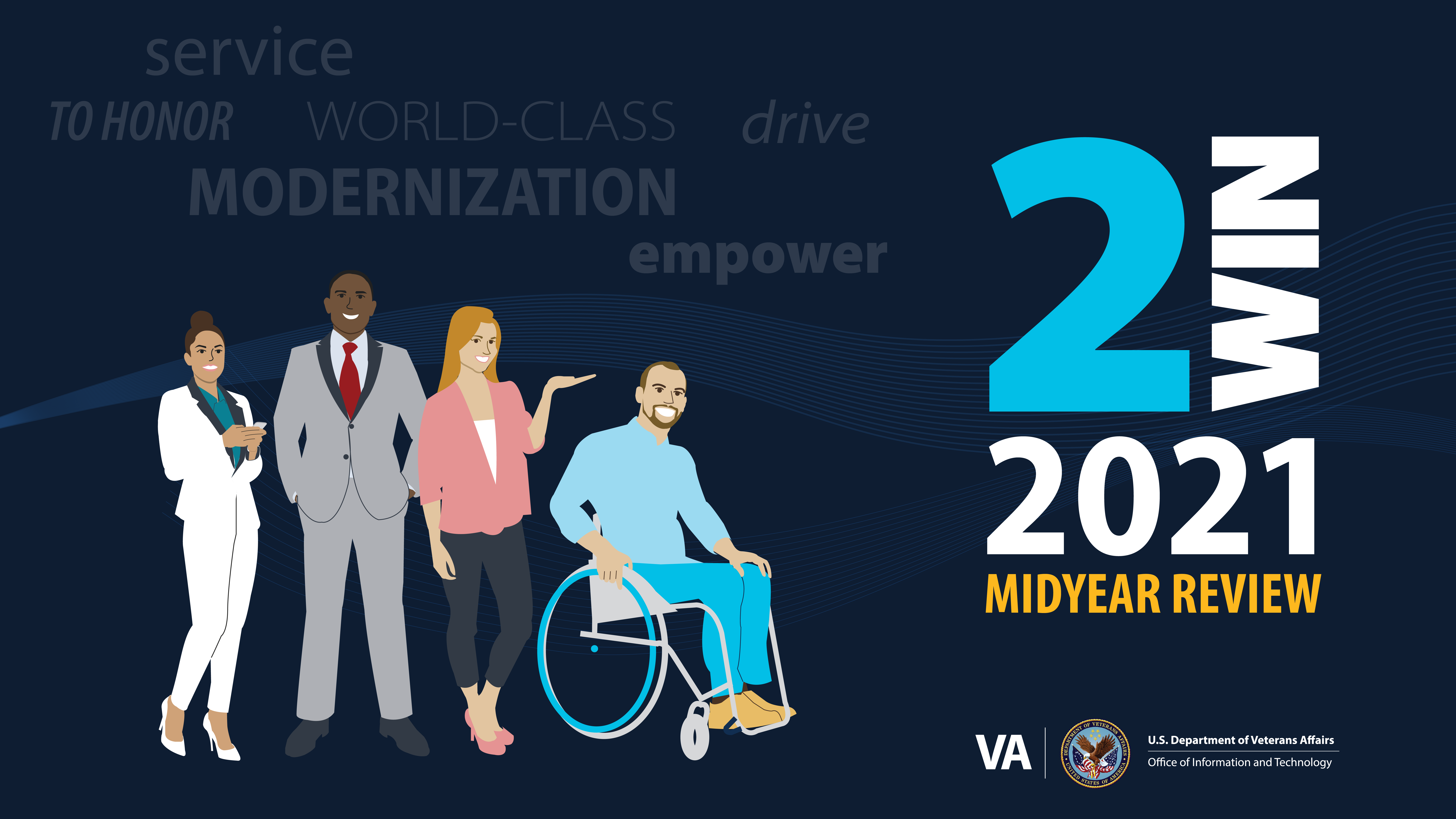
The illustration style is most acceptable when messaging is energetic and lively. It is best used when trying to convey an open and welcoming tone, allowing users to focus on the faces and energy of the characters themselves over their surroundings. The “Expressive” style excels in conceptual situations, whereas the “Lifelike” style shows strength in accurately representing real people and faces.


Incorrect Uses
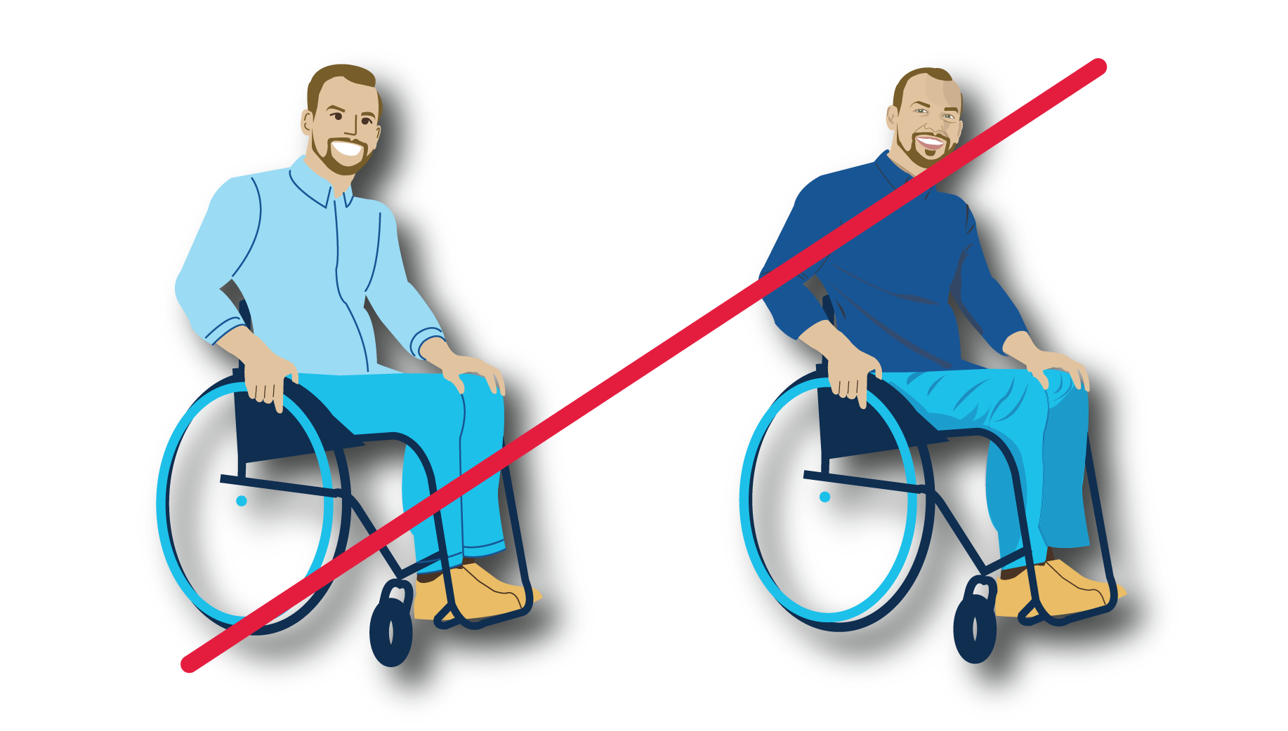
Never use drop-shadows or any other effects
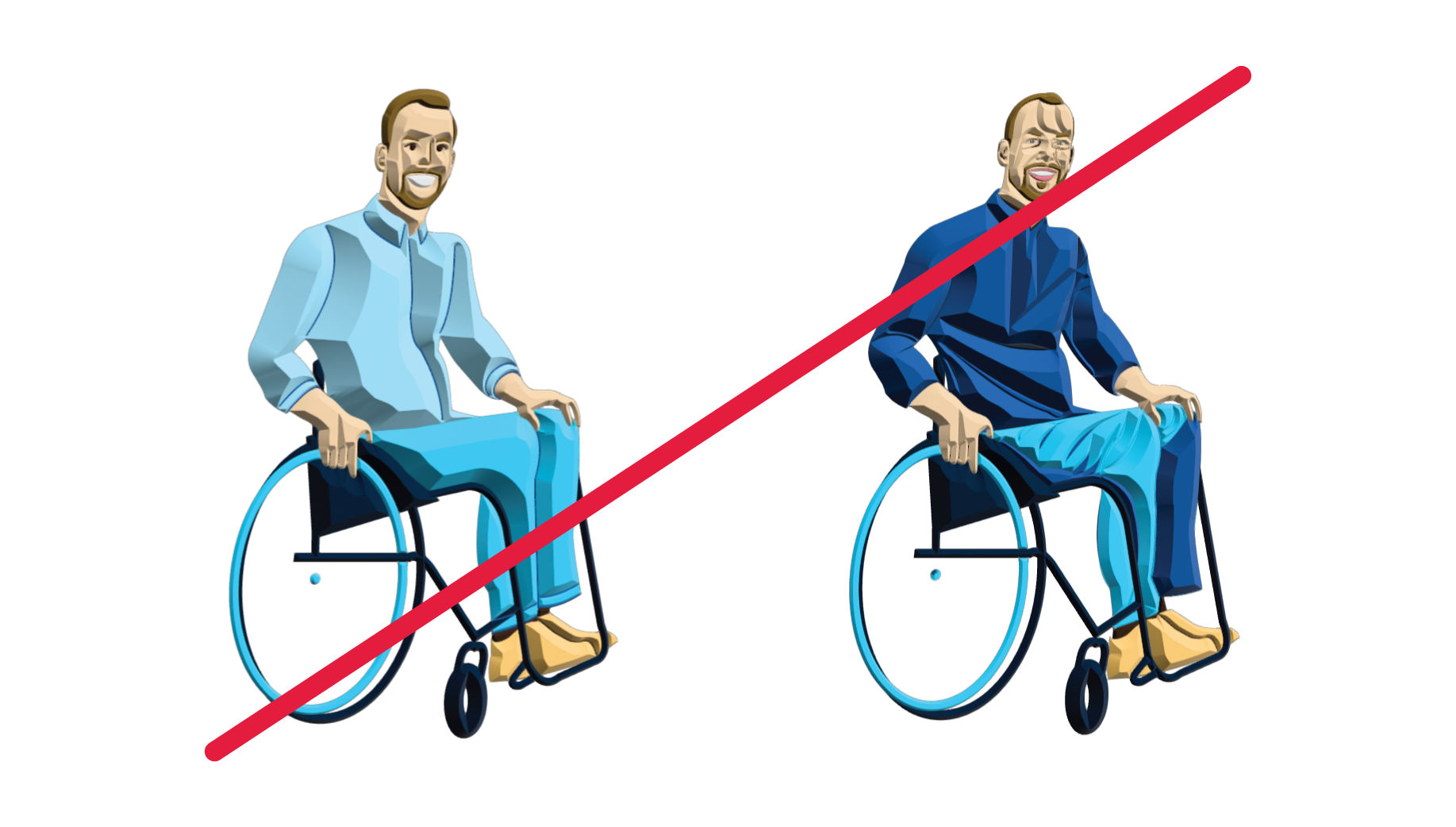
Never use bevel effects or attempt to add 3D dimensionality
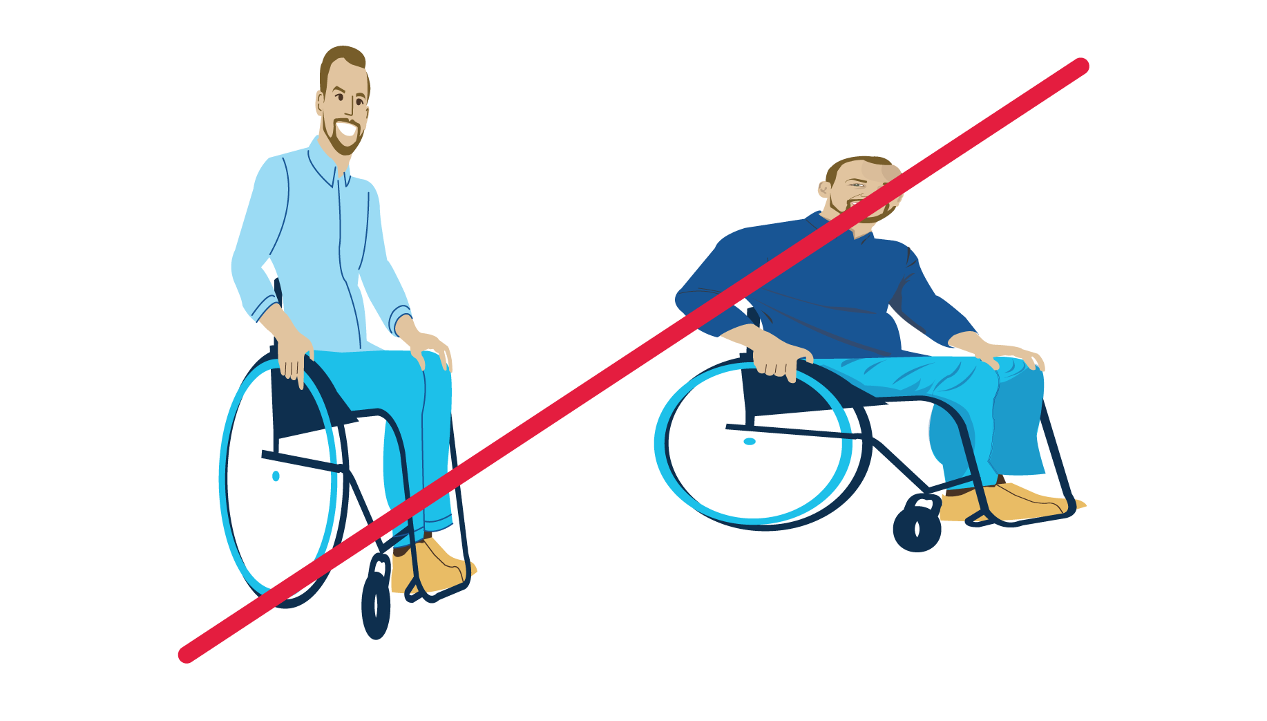
Never change the size proportion. The characters should always be sized proportionally.
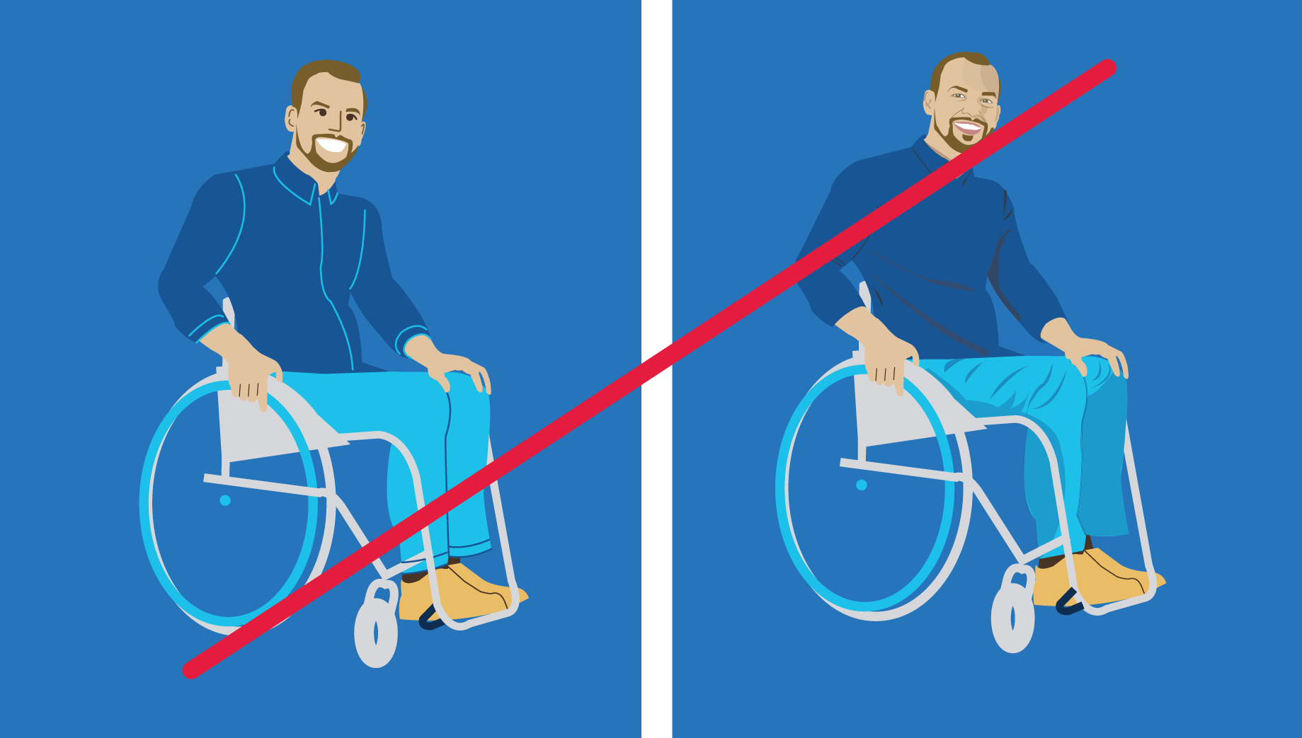
Ensure appropriate contrast when placing the illustration in a colored background.
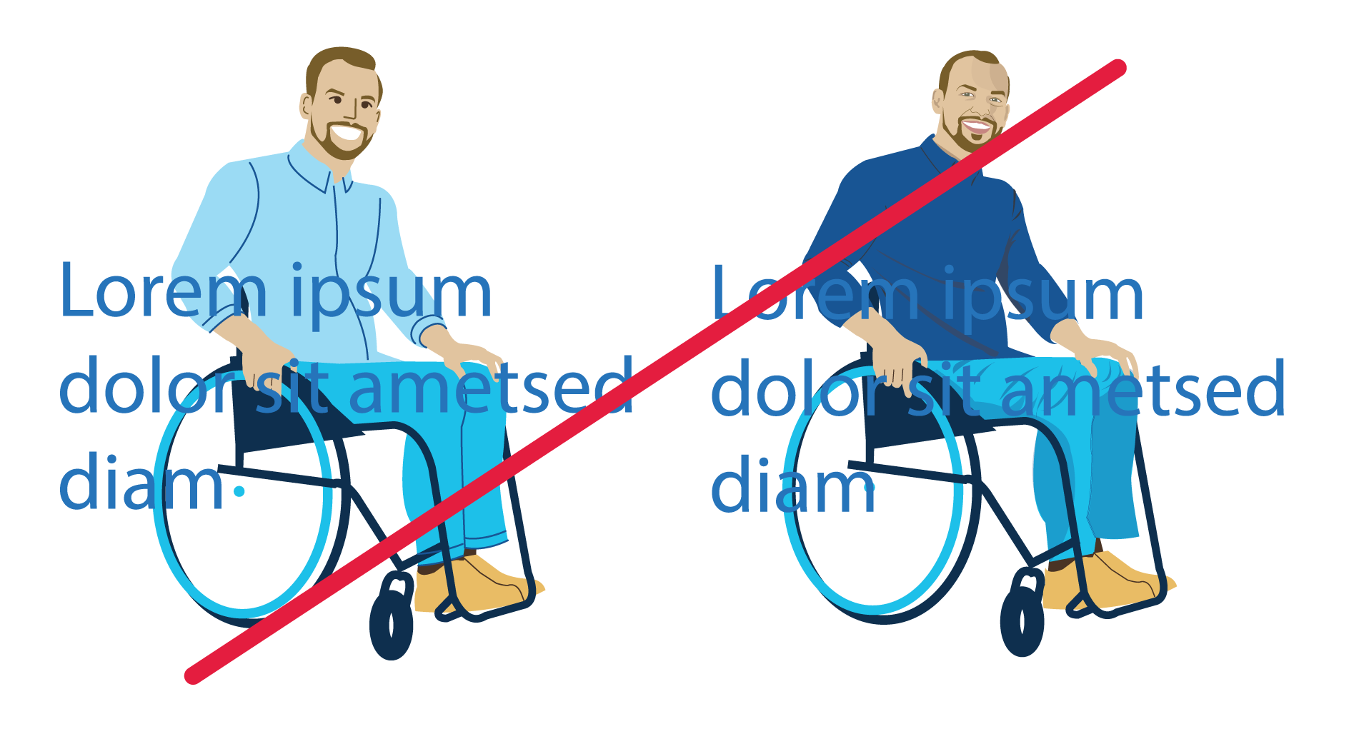
Text should not be overlayed onto the characters.
Mixing illustration styles within the spectrum should be done with intention and consistency.
