
OIT’s new iconography style is based on brevity, clarity, and accessibility. The simplified line approach improves clarity and scalability, while the interior spacing enhances legibility.
Iconography should be informative and functional, conveying ideas that support content rather than abstract forms. Icons should be versatile enough to convey multiple meanings in various contexts.
The old iconography style should no longer be used and will be moved to legacy status.


Old style


New style
Structure
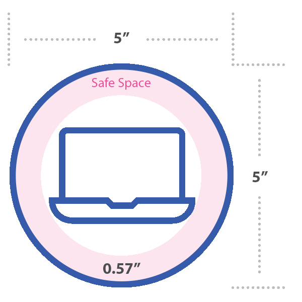
- The base grid should be 5” by 5” with a safe area of 0.57”.
- The outer circle and inner icon design use a 10pt stroke.
- Rounded corners enhance approachability and versatility.


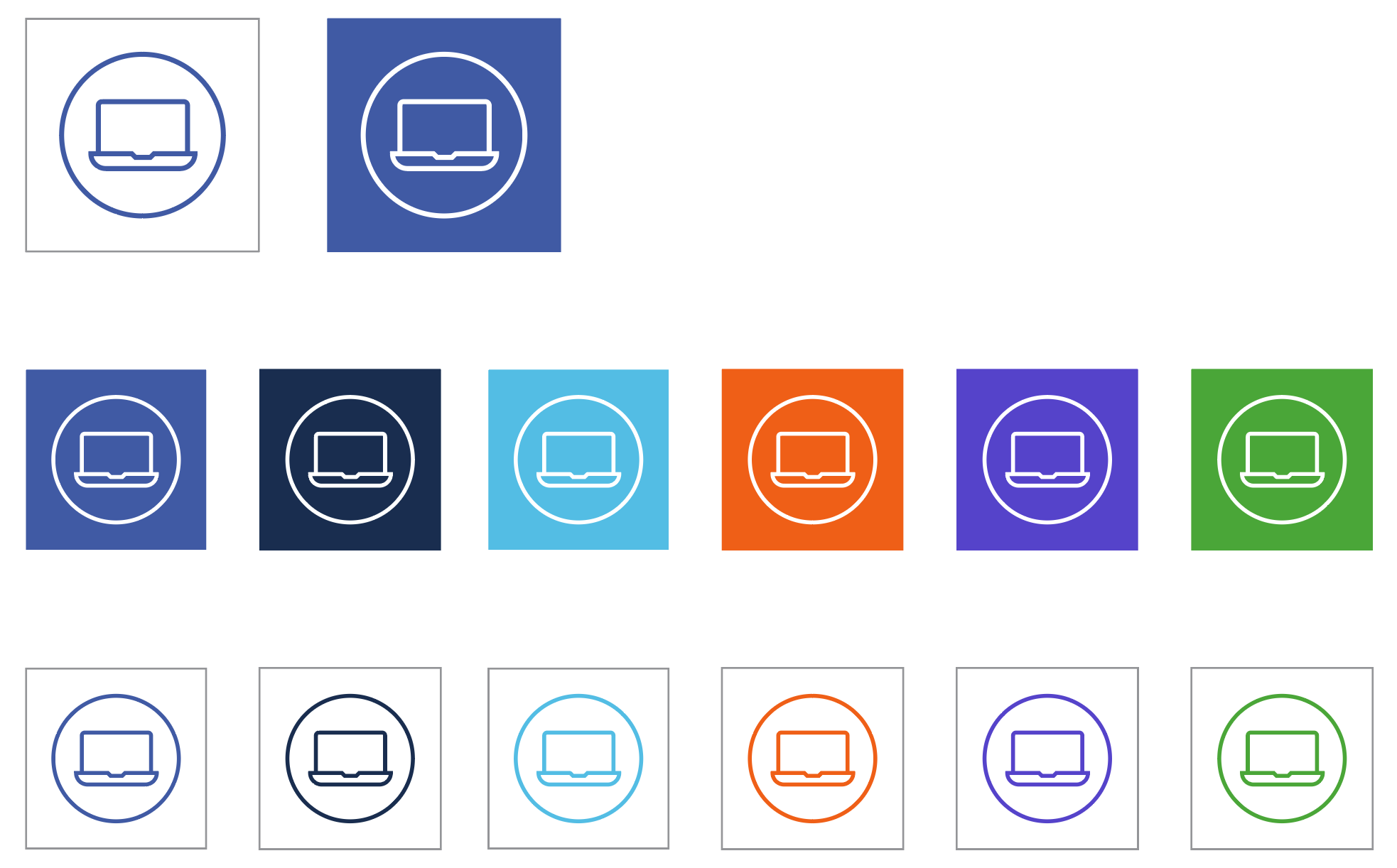
Color
The preferred use of icons is in blue on a white background. However, icons can be used in all primary and secondary colors.
Acceptable Uses
Iconography design provides users with flexible solutions to fit their needs, which may include creating certain identifiers, with or without accompanying text descriptions, that can visually represent an idea, topic or their unique campaign, office, or product identity.
Logos broadly refer to the VA OIT Signature Logo and approved variations thereof. Custom and or unique logo design is generally not permitted, with a minimal exception.
Icons are not logos and should not be used in place of the official VA signature logo and seal and the approved DigitalVA logo. Please refer to the Logo section of this guide for the appropriate use of logos.
Icons used as identifiers should maintain a visual connection to their parent divisional icon. To maintain consistency and alignment with the brand, custom identifiers should use the structure defined to the right. Please contact ITSC Graphics and Creative team for templates. Icons must be approved through ITSC and Front Office prior to use, regardless of intended distribution.
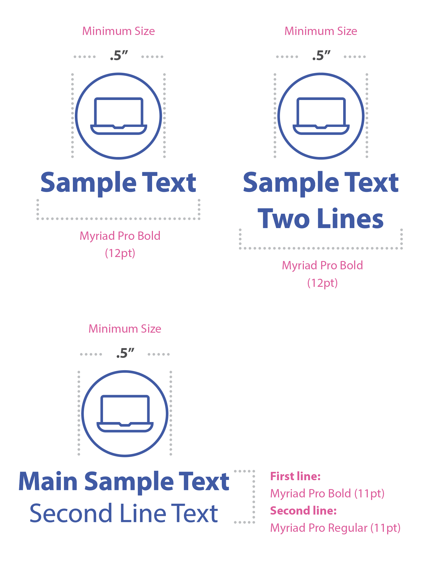
Icon and text layout
Incorrect Uses


