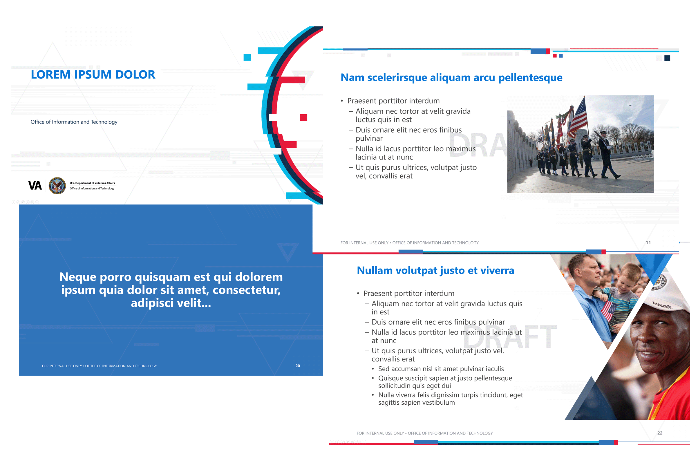
Templates and files are only available to VA staff while authenticated on the VA network.
This VA OIT PowerPoint template is intended for internal and external audiences. It addresses OIT’s One Voice Policy, increases consistency and versatility, reduces brand chaos, and provides the foundational structure for an accessible presentation.
Accessibility – Accessibility starts with you. When creating content, spell out all acronyms on first instance. Replace slashes with “and” or “or” as appropriate. Avoid using symbols such as “*”. Do not use ampersands unless they are part of a proper name. Please refer to the Accessibility Guide for additional information.
Plain Language – The text in your presentation must be easily understandable. Please refer to the plain language requirements for guidance.
Font – The new approved font for use with PowerPoint is Segoe UI. Font sizes should not be less than 18pt to meet accessibility standards.
Graphics and Images – Graphics and images should be in accordance with our Guidelines.
Appropriate color use
Color – Please use the color theme built into the template. Make the overall color impression and color balance proportionally consistent so that the presentation is visually cohesive. In order to achieve this, always use a minimum of 75 percent core brand colors (dark blue, medium blue, light blue, and white).
Color Contrast – In text and images, provide sufficient contrast between the foreground (text or graphics) and the background. Use the WebAIM Color Contrast Tool for testing.
Primary colors
White
#FFFFFF
VA Blue
#0E1D33
Blue
#112f4e
Bright Blue
#0076D6
Cyan
#00BDE3
Accent Colors
Bright Cool Red
#E41D3D
Medium Gray
#919191
Secondary accent colors
Gold
#FACE00
Orange
#E66F0E
Light Green
#7FB135
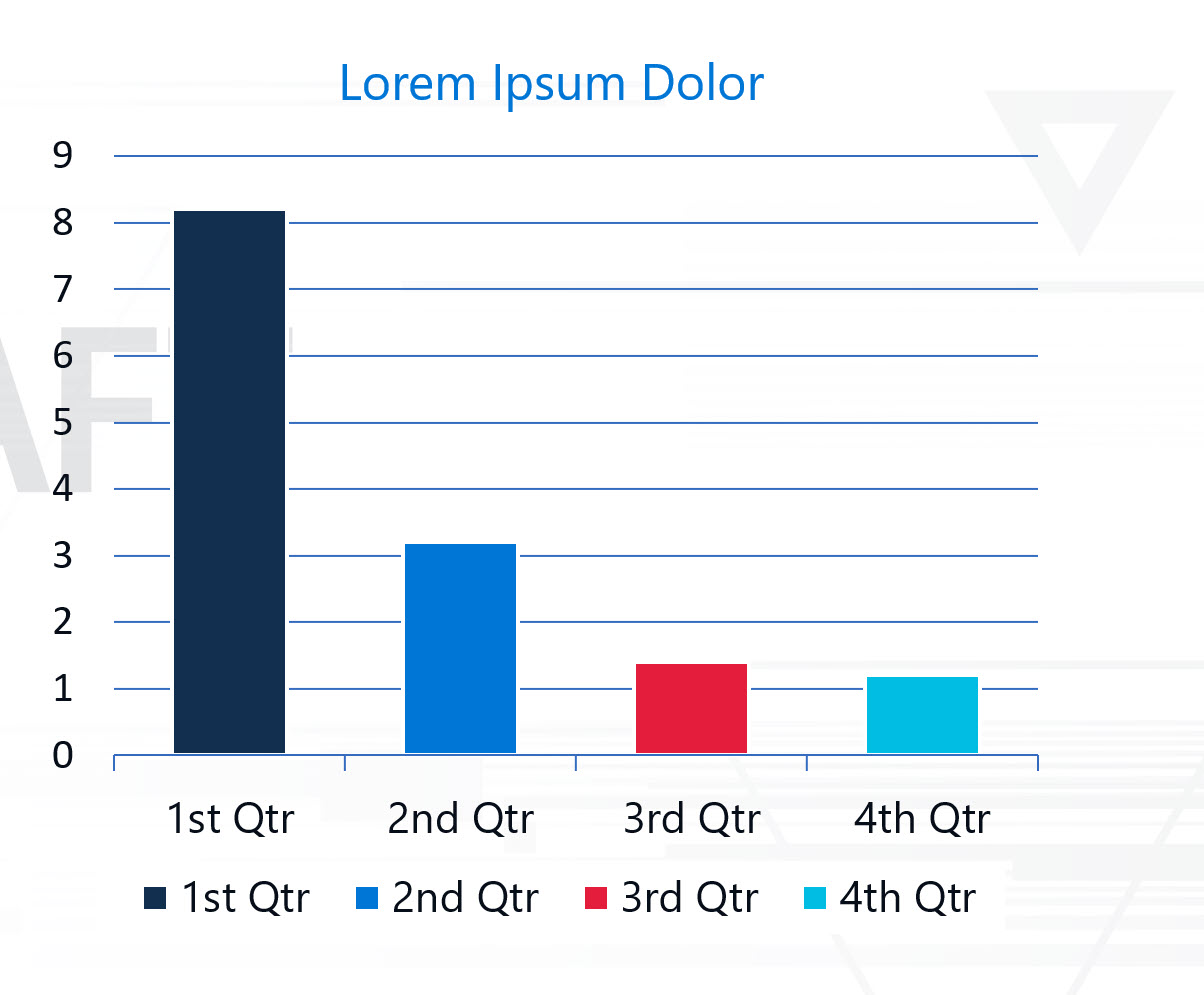
PowerPoint chart and graph tool
Charts and graphs created with PowerPoint’s built-in tools should be readable and easily understandable.
- Color – Please use the color theme built into to the template. Ensure you maintain proper color proportionality and contrast.
- Alt text – Charts and graphs require alt text to be compliant. Ensure appropriate alt text and full text descriptions are provided for complex charts and graphs.
- Title – Charts and graphs must include a title.
- Legend – A legend must be included.
- Font size – Font sizes must be at least 16pt to ensure legibility

PowerPoint Best Practices
Dos
- Start with full accessibility in mind
- Use slides to augment your presentation
- Commit to one main idea per slide
- Include visuals to reinforce your message
- Use high-quality graphics
Don’ts
- Don’t leave accessibility as the last “step” in the process
- Don’t use full paragraphs or numerous bullets
- Don’t use clip art
- Don’t use SmartArt
- Don’t use tables for layout


