Step 1: Create a File
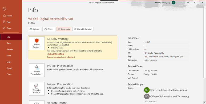
When creating a file for your digital content, start by using the latest version of the Office of Information and Technology (OIT) document templates available in the OIT design guide , and be sure to fill out the document properties.
Templates
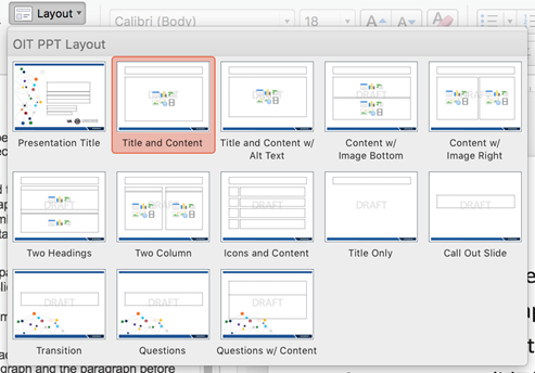
Start by using the latest version of the OIT document templates available in the OIT design guide. OIT designed these templates to make accessibility as easy as possible. In the case of PowerPoint, use the widescreen template unless you know for a fact that this format will not be supported where it is being presented.
Document Properties
Fill in the document properties, which gives audience members using Assistive Technology more information about the document they are reading and makes your documents easier to find using search tools.
In all Office 365 tools, you can find the document properties by selecting File > Info. Be sure to complete the title, author, and keywords at a minimum. The author should always be “U.S. Department of Veterans Affairs, Office of Information and Technology” and never a personal identifier.

Step 2: Use the Accessibility Checker
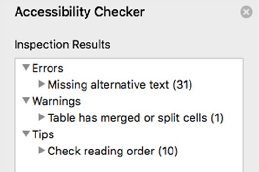
Microsoft products have a built-in accessibility checker under the “Review” tab in the navigation ribbon. Turn this tool on at outset of creating digital content and frequently check for and resolve errors.
The Accessibility Checker tool helps create accessible content by identifying potential issues for people with disabilities in reading content or using the document. Please note that the accessibility checker is one tool — just because there are no errors in the accessibility checker does not mean your document is 508 compliant or accessible.

There are three categories of accessibility checker issues:
- Error: content making the document difficult or impossible to read and understand
- Warning: content making the document difficult to understand
- Tip: content people with disabilities can understand but could be presented in a different way to improve the user’s experience

Step 3: Write content that is easy to understand
Text is the key to accessibility. First and foremost, the text in your documents must be easily understandable. In fact, there is a law that requires everything to be written in plain language.
Know Your Audience
One of the most popular plain language myths is that you have to “dumb down” your content so that everyone everywhere can read it. That’s not true. The first rule of plain language is to write for your audience. Use language your audience knows and feels comfortable with. Take your audience’s current level of knowledge into account. Don’t write for an 8th-grade class if your audience is composed of doctoral candidates, small business owners, working parents, or immigrants. Only write for 8th graders if your audience is, in fact, an 8th-grade class.
However, just because you are writing for other Office of Information and Technology staff members, do not assume they know what you are talking about or are familiar with jargon you may use daily. At a minimum, spell out all acronyms and abbreviations on the first instance.
Things to Avoid
- Abbreviations (acronyms, initialisms, and abbreviated names)
- Abbreviations are shortened forms of words or phrases such as approx. or Feb.
- Initialisms are abbreviations that use the first letter of each word to form the abbreviation, such as VHA, VBA, NCA, EHRM, or OIT.
- Acronyms are similar to initialisms, but the letters are used to form an abbreviation that is spoken as a word, such as NASA, VACO, and LASER. Some acronyms can be used because that is their most common and understood usage such as NASA or VistA.
- Technical jargon (know your audience)
- Slashes in place of “and” or “or” (e.g., “red and/or blue” should be “red or blue, or both”)
- Passive voice
- Run on sentences and long paragraphs
- Meaningless filler phrases
- Thinking outside the box
- Value added
- Best practice
- For all intents and purposes
- Touch base
- Integrating quality solutions
- Promoting an informed and inclusive multicultural society
- Embedded media. If you must embed video or audio, they must also be accessible.
VA Style
- “Veteran” is always capitalized!
- Use AP style
- Don’t use ampersands “&” unless they are part of a corporate name, e.g., AT&T. VA initialisms should not use an ampersand – there is no “&” in “OIT.”
- Do not use the word “the” before VA
- “Health care” is two words unless part of a brand or name that chooses otherwise
OIT Style
The Office of Information and Technology follows AP style, with some notable exceptions:
- Use Oxford or serial comma
- Only capitalize “federal” when used as part of a proper name or when used with “government”
- Do not abbreviate “million” or “billion” as “M” or ”B”
- When writing time, a.m. and p.m. are always punctuated and lowercase
- There is no “&” in “OIT.”
Step 4: Ensure text and images provide sufficient contrast
An important aspect of color for both low vision and colorblind users is sufficient contrast between the foreground (text or graphics) and the background.
OIT digital content must meet Web Content Accessibility Guidelines (WCAG) version 2.0 criteria. All OIT documents and websites will meet a minimum AA rating and AAA wherever possible. The colors chosen in the OIT design guide have been selected to ensure that the base colors meet the minimum contrast requirements, but if you need to extend the color palette, several online tools are available to help determine if the colors meet the minimum criteria.
Do not use color as the only method of emphasis. If your audience has certain color perception problems, they may not be able to see the color you chose. Make sure to also bold text or use text or symbols in addition to color in images to make sure your meaning is clear to all.
Additional Tools
Step 5: Add alt text to images
Images are a wonderful way to draw attention, or to build on a story, or to provide visual reinforcement to a concept you are trying to explain. However, if your audience has a vision impairment that prevents them from seeing the image clearly or at all, you need to provide alternative text, or “alt text.”
Alt Text
To minimize frustration and to increase understanding, images that are intended to convey meaning must have a text description. Fortunately, documents created in Word can take advantage of the alternative text attribute — commonly referred to as “alt text.” Alt text is a description of an image that’s shown to people who can’t see the image and is meant to convey the meaning of that image to the audience.
General Guidance for Alt Text
- All images must have alt text or be marked as decorative.
- Images intended to convey meaning must have a textual equivalent available.
- Avoid text on images and do not use images that are just text.
- Don’t use abbreviations.
- Use punctuation for full sentences.
- Describe the image, such as, “Group of people at an airport.”
- Alt text should consider the context in which the photo is being used and be as meaningful as possible.
- Keep the alt text clear, meaningful and concise (due to screen reader behavior and general useability, the text should be less than 250 characters). If longer text is required to convey the message, use captions or the surrounding text, and then in the alt attribute use very basic text.
- Don’t repeat the text of an adjacent caption. Screen readers read both the caption and the alt text, so avoid having the same details in both.
- End alt text with a period. This signals the screen reader to pause before proceeding.
- If the image is just decorative and conveys no real meaning, use the “Mark as decorative” checkbox. Minimize the use of decorative images – they can be a distraction and they increase the file size.
- If the image is a hyperlink without any text, it must have alt text. If the link includes the image and text, then the empty alt can be used to avoid redundancy.
- Do not use “a picture of,” “an image of,” “a photo of,” “the so-and-so icon.” Screen readers tell the user that there is an image and then read the alt text.
- Do begin with “Screenshot of … ” if the image is a screenshot
- Manually check that all alt text is entered correctly, Microsoft auto-generates alt text for images, but this text should be removed unless it has been verified to be correct.
Captions
Captions must not be seen as a replacement for content that should be in the body of the article but can be used in lieu of alt text if greater explanation is needed. Captions can provide additional understanding to all users if the image represents concepts that may not be universally understood or are abstract in nature.
Other Resources
- World Wide Web Consortium (W3C) Alt Techniques
- WebAIM Alternative Text
- The A11Y Project – Using alt text properly
- Axess Lab – Alt-texts: The Ultimate Guide
Step 6: Provide meaningful links
Links should tell people what action to take, where to go next, or what information to expect when they select the link. Create link text that’s as specific as possible. For example, instead of linking text like “Click here” (which may not make sense for folks using screen readers), consider instead something like “Download the full report.” Descriptive links provide all users more information about an action they may undertake.
- Use natural and descriptive language. Make sure the voice and tone of your link text match those of the rest of the content to create a more consistent experience. Site visitors using screen readers and those reading page copy won’t be jarred from their experience if all text reflects the same voice and tone guidelines.
- Hyperlink the most relevant word or phrase.
- Avoid “Click here,” “Learn more,” “See more,” “Read more,” and other generic phrases.
- Include information about what a link leads to; this is especially important for mobile device users. If you’re linking to a PDF, say so.
- Don’t punctuate links. Exception: When the link text is a question.
- If the link text comes at the end of a sentence, don’t hyperlink the ending punctuation.
- Don’t make links open in a new window. Exception: Downloadable documents can force a new window or tab, but the label should indicate this behavior.
- Do: If you have additional questions, contact us immediately.
- Don’t: Click here for additional information.
- Do: You should review the list of PIV office locations to find the nearest one to you.
- Don’t: Click here to see a list of PIV office locations.
WCAG 2.0 references
Step 7: Use proper text formatting and styles
When creating digital content for PowerPoint, use approved VA and OIT fonts, ensure all slides have a unique title, and all content is placed within the predefined content placeholders available in the slide layout (it is otherwise invisible to assistive technology).
Fonts and Sizes
In general, use recommended standard fonts: Times New Roman, Georgia, Verdana, Arial, Tahoma, Helvetica, or Calibri. Approved VA fonts for use include Myriad Pro, Georgia, and Calibri. OIT templates use Calibri exclusively.
Consider the context of your audience. If you are presenting in a large hall, someone at the back of the room will not be able to see 12pt size text on your slides. A good rule is to keep text above 18pt.
PowerPoint Slide Titles
Every slide must have a unique title. Duplicate titles make it difficult to navigate the PowerPoint document. For example, screen readers have the ability to skim slide titles. If there are duplicate slide titles, it can be difficult to know which slide might be most useful or relevant.
Slide Layouts
When placing content on a slide, ONLY place text, images, tables, etc. into content placeholders that are in the available slide layouts. Any text boxes, images, or tables you manually add to a slide cannot be accessed by assistive technology. If you need a layout not provided in the available layouts, you can create a new master slide or contact the ITSC graphic support team to create one.

To check that all of your text is accessible by assistive technology, select “Outline View” under the “View” tab in the ribbon. All of your text should show up in this view in the correct order. If it does not, you may not be using the default content placeholders correctly. Tables and images do not show in the “Outline View” (this is ok).Â
Step 8: Create accessible tables
Tables should be used for data and not layout. Tables should be used for data and not layout. Tables can be very difficult for screen readers to understand unless there is a clear relationship between header and data cells. It is best to use simple tables with one row of column headers and no nested rows, columns, or merged cells. Avoid blank rows, columns, or cells. Avoid using tables for layout or formatting purposes, such as formatting a numbered list.
Complex tables can also be made accessible in HTML or using Adobe Acrobat Pro. However, complex tables can often be simplified by breaking them into multiple simple tables with a heading above each.
To make simple tables accessible, select the row that contains the column headers, select the “Table Design” tab in the PowerPoint ribbon, and then check “Header Row.”

Step 9 – Review the content
- If you use images on every page, make sure they are necessary to convey meaning and that the alt text or surrounding text explains in detail that meaning. Excessive use of imagery that is simply decorative can cause confusion and can dramatically increase the size of the file, making access to the file more difficult for those with slow connections.
- Do not use WordArt and graphic treatment of text.
- Check for reading order using the selection pane. Items are read by the assistive technology in order they are placed on the page. Checking the outline view confirms proper use of placeholders, but does not verify logical reading order of all items. In this screenshot, all appears fine in outline view, but the reading order of the slide is not correct. Items should read bottom to top in the desired logical order.
Step 10: Be careful when converting to PDF
Converting a 508-compliant PowerPoint presentation to a PDF does not mean the PDF is 508-compliant. There are separate steps that must be taken to make the resulting PDF 508 compliant. If you require assistance with PDFs, we strongly recommend reaching out to the VA Section 508 Office for information and training until a guide is available.


